Every April, International Pink Day is celebrated — a global initiative against bullying and discrimination. The idea is simple: wear pink to make visible the rejection of homophobia, transphobia, and all forms of exclusion. It’s not just a day about a color. It’s a day about what that color represents when it’s chosen by those who were historically singled out for wearing it.
And that, for those of us who work in fashion and brand visual identity, says a lot. Pink has never been neutral — not on the street, and not on a label. It’s a color that has been appropriated, reclaimed, and returned transformed time and again throughout history. It has been a symbol of fragility and resistance, of consumerism and protest, of luxury and subculture. Few colors have carried so much meaning in so little space.
For those of us who work on fashion labels and packaging, pink is a fascinating — and, let’s be honest, sometimes uncomfortable — territory. It can feel too obvious or too risky. But at the right moment, in the right shade, a pink label carries a visual — and symbolic — force that very few colors can match.
A color with more history than it seems
There’s a widespread idea that pink has always been “a girl’s thing.” Nothing could be further from the truth. Well into the 20th century, the logic was exactly the opposite: pink was considered a virile color, a softened version of red — the color of strength and power. Baby boys were dressed in pink and girls in blue, which was considered more delicate and refined. This is documented, among other sources, by the Smithsonian Magazine in an article on the history of gender and color.
The feminization of pink took hold in postwar 1950s culture, when Dior and Hollywood turned it into a promise of domestic glamour. In the 80s and 90s, it entered punk and queer culture as a tool of subversion, and stopped being merely sweetness to become ironic, political, and loud. In 2023, the Barbie phenomenon relaunched it with unprecedented force: brands, from luxury to fast fashion, embraced it without hesitation. Pink was no longer apologizing.

What the color pink communicates
Color psychology isn’t an exact science, but there are emotional responses to pink that recur with considerable consistency. The Color Psychology Institute and other studies on color perception point in similar directions:
- Pale and powdery pink: evokes delicacy, care, and well-being. Works very well in cosmetics, lingerie, and premium basics.
- Saturated pink and fuchsia: conveys confidence, boldness, and modernity. There’s nothing passive about a well-used hot pink.
- Nude or make-up pink: has become the new neutral of luxury. Sophisticated without shouting, warm without being cloying.
- Bubblegum pink: has a playful self-awareness to it, a refusal to take itself too seriously. Works well for brands that play with nostalgia or pop culture.
The key is that the same color can say completely different things. The difference between “childish” and “elegant” is often just a matter of saturation and what the pink shares the label with.
The shade map: which one to use and when
One of the most important decisions isn’t whether to use pink, but which pink. Broadly speaking:
- Blush / pale pink: delicate and timeless. Ideal for bridal fashion, childrenswear, or premium lines with a natural sensibility.
- Dusty pink / rose: the great winner of the last decade. Grown-up, subtle, and very photogenic. Works across almost every segment.
- Flamingo / mid pink: cheerful and contemporary. How it reads depends a lot on what surrounds it.
- Hot pink / fuchsia: pure energy. For brands that don’t ask for permission — best used in controlled doses.
- Nude / make-up pink: the safest bet for modernity without risk. Especially powerful in satin finishes.
- Bubblegum pink: nostalgic and playful. Pairs especially well with black.
How to apply it to fashion labels
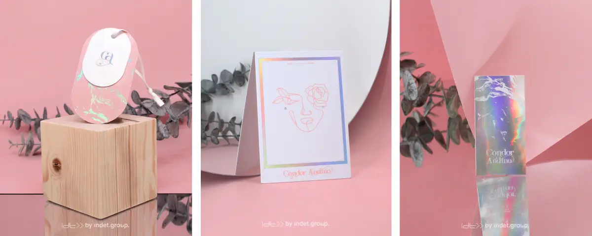
Before getting into the technical details, it’s worth saying something that is often overlooked: the finish changes everything. A pale pink in matte communicates one thing; the same shade in satin or metallic, something else entirely. For luxury brands, pearlescent satin on nude pink is hard to beat.
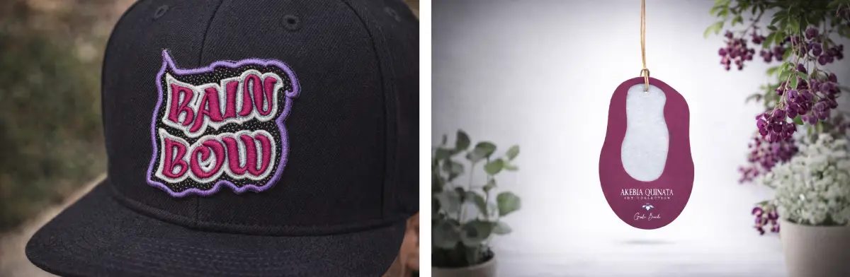
For example, pink with black is one of the most powerful combinations. This pairing has a long history in fashion — from Chanel to urban subcultures — and works because black anchors the pink and gives it authority without stripping away its character.
Typography is a powerful modulator. A classic serif on dusty pink says luxury. That same font condensed in hot pink says attitude. The typeface and the shade need to speak the same language.
It doesn’t need to be used as a background. A pink detail — a line, the interior of a label, the stitching — can be more effective and more elegant than an entirely pink label. Dosage matters.
Think about the channel before choosing the shade. A vibrant fuchsia may be perfect on social media and challenge the perception of value in certain physical retail environments.
Rarity is also a strategy. In categories where nobody uses pink — technical wear, workwear, men’s accessories — it can become a highly memorable differentiator.
Why now is a good moment
We are at a moment when fashion brands are revisiting their palettes with a more emotional and less rigid eye. The minimalism of the 2010s — that eternal white-black-beige — has given way to a search for color with intention.
Barbiecore had a more lasting impact than it might appear: it normalized the use of pink without irony in luxury. Valentino took it to Haute Couture, Acne Studios uses it with Scandinavian coolness, and Jacquemus has made it a core part of its brand identity. And many smaller, niche brands are adopting it as a hallmark of modernity and confidence, as Business of Fashion notes in its analysis of 2024 palettes.
You don’t need to follow trends to use pink well. You need to understand what your brand is saying and find the shade that says it in pink. And if you’re thinking about introducing pink — or another color with a story — into your label identity, we’d be delighted to guide you through the process.