
Ask ten people to imagine a label ‘inspired by the sea’ and almost all of them will picture the same thing: a navy blue, perhaps a white, maybe a turquoise stripe. There’s nothing wrong with that. But it doesn’t say anything we haven’t seen a hundred times before.
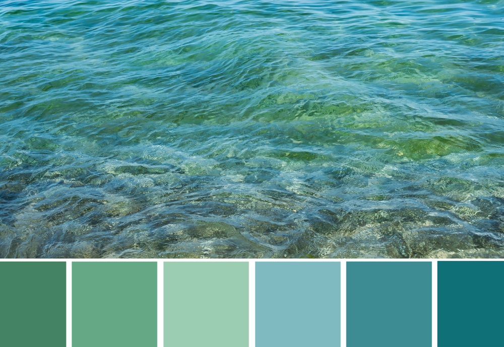
Now think of a specific sea. The Geirangerfjord in Norway, first thing in the morning, when the water is still a greenish grey and mist covers the slopes. The Cantabrian Sea in November off Rodiles beach, leaden, with almost yellow foam. The black volcanic sand of Reynisfjara in Iceland. The turquoise sea of Whitehaven Beach in Australia, over sand so white that the water seems lit from below. None of these places is ‘navy blue’, and each one gives a palette with a personality of its own.
That’s the difference between using nature as a generic label and using it as a genuine source of inspiration. In this article we explain why the colours of a landscape work so well, where the habit of ‘copying’ them comes from and, above all, how to get from a place to a palette that can be woven or printed in just a few centimetres.
We like colours for what they remind us of
There is a fairly convincing explanation for why nature is such a good teacher of colour. In 2010, researchers Stephen Palmer and Karen Schloss put forward what is known as the ecological valence theory. Their idea is simple: we like a colour to the extent that we like the things we associate with it. Blues come out well because they remind us of a clear sky or clean water; certain browns, on the other hand, can evoke spoilt food.
The practical consequence for a brand is significant. The same shade can work for or against it depending on what it evokes in the person looking at it. A brown that recalls pine bark or wet sand conveys something very different from a brown with no context. That’s why starting from a specific landscape helps so much: the colour arrives on the label with its positive association already built in.
Nature also teaches us how to combine colours. A recent study asked more than 300 participants to rate pairs of colours. The combinations they liked most matched, on average, those that appear most frequently in images of natural landscapes. In other words, when we copy a palette from nature, we don’t just borrow a set of colours; we also borrow a harmony we have already seen thousands of times.
A craft with two centuries of history
Copying the colours of nature isn’t an Instagram idea. In 1814, the Scottish flower painter Patrick Syme published Werner’s Nomenclature of Colours, an expansion of the system that the German geologist Abraham Gottlob Werner had created to describe minerals. Syme added a painted swatch to each colour, along with an example from the animal and plant kingdoms, eventually bringing together 110 shades.
Charles Darwin took that little book with him aboard the Beagle and used it to record precisely what he saw. In one of his notes he describes the sea as ‘indigo with a little azure blue’. The nuance is striking: he doesn’t say ‘blue’; he says exactly which blue. Today the catalogue is regarded as a forerunner of systems such as Pantone.
A century and a half later, the French colourist Jean-Philippe Lenclos took the idea further with his geography of colour. From the 1970s onwards he travelled through regions of France and around the world recording their colours, convinced that a place’s palette is born of its materials, its soil, its vegetation and its traditions. In his book Colors of the World he shows how geology, climate and light give each landscape a chromatic character of its own.
The underlying idea is always the same: a place doesn’t have ‘a colour’; it has a palette.
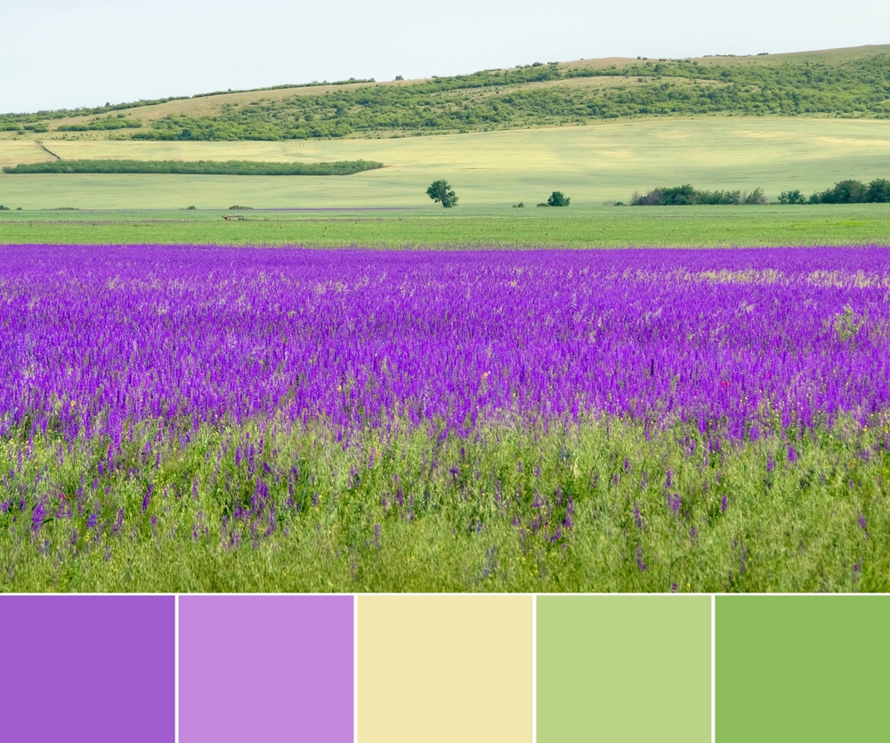
Five steps from landscape to palette
You don’t need to be a naturalist to extract a palette from a landscape, but you do need to look a little more closely than usual. This is our process:
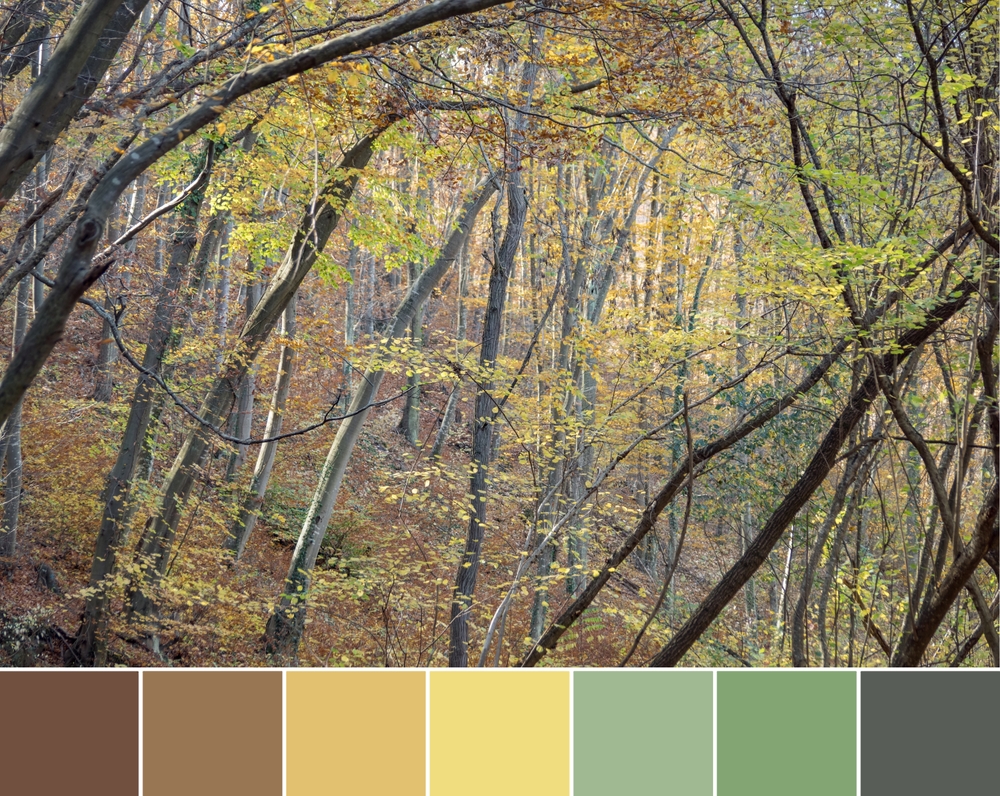
- Choose a specific place, not a category. ‘Forest’ isn’t a starting point; ‘a beech wood in October’ is. Add the moment: the time of day and the season completely change the light and, with it, the colours. Look for a place that makes sense for the brand, too: its origins, where the garment is worn, or the world its customers imagine.
- Gather references – physical ones if possible. Photos at different times of day, yes, but also a stone, a dry leaf or a handful of sand. A screen alters colours; a sample in your hand doesn’t.
- Extract plenty, keep little. Pull ten or twelve shades from your references (tools such as the eyedropper in any design software help) and narrow them down to four or five. Discard those that are too similar to one another and those that only appear because of a reflection or a shadow.
Give each shade a name. ‘Storm grey’ or ‘lichen’ say far more than a code. A good name helps the whole team talk about the same thing and, as a bonus, becomes part of the story you tell about the collection. - Respect the landscape’s proportions. In nature, colours are almost never shared out equally: there is one that dominates, others that accompany it and a small detail that catches the eye. It’s the same logic as the well-known 60-30-10 rule in design, which divides the space between a dominant colour, a secondary colour and an accent. Be careful, though: what stands out most in a photo is rarely what takes up the most space.
- Give each shade a name. ‘Storm grey’ or ‘lichen’ say far more than a code. A good name helps the whole team talk about the same thing and, as a bonus, becomes part of the story you tell about the collection.
An example: the sea without navy blue
Imagine a knitwear brand from the north that wants a label inspired by its coastline. Applying these steps, the palette might look like this:
| Paper | Tone | Origin | On the label |
| Dominant | Lead gray | The sea and the sky on an overcast day | Background of the woven label |
| Secondary | Moss green | Cliffside grass | Logos and main text |
| Secondary | Damp sand | The beach at low tide | Cardboard hang tag |
| Accent | Yellow lichen | Patches of lichen on the rocks | A stitch or a small detail |
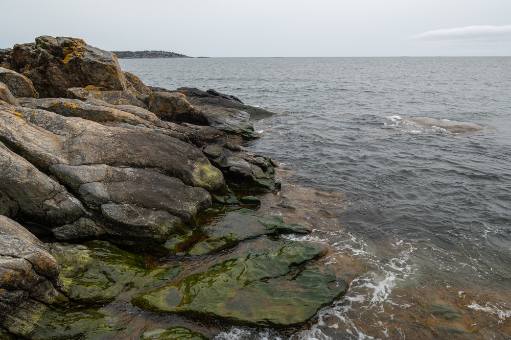
None of these colours is ‘navy blue’, and yet any of them can evoke a seascape like this one.
From palette to a few centimetres
A beautiful palette on a mood board can be completely lost by the time it reaches the label. There are four issues worth resolving before signing anything off.
Contrast depends not on colour but on lightness
Natural palettes tend to have shades of similar lightness: muted greens, greys, sands. Together they are harmonious, but text in moss on a lead-grey background can be almost illegible. The contrast that matters for legibility is measured in lightness, not hue. As a guide, web accessibility guidelines call for a ratio of at least 4.5:1 between text and background. A quick trick: take a black-and-white photo of the label. If the text disappears, the problem isn’t the colour.
The same shade changes depending on the material
A lead grey doesn’t look the same in satin polyester thread as it does in matt cotton or printed on kraft card. The sheen, texture and base colour of the material all alter the result. That’s why we work with a physical colour guide and always run a real-world test before going into production.
Not every shade has to go on the woven label
The full palette can be spread across the different pieces: the dominant colour on the neck label, the secondary on the swing tag and the accent on a detail of the bag or a cord. That way the brand keeps the whole palette without overloading a tiny surface.
Tell people where it comes from
If the palette comes from a place, say so. A line on the swing tag or the name of each shade on the product page turns an aesthetic choice into a story – and a well-told story is what makes customers remember the garment.
Seeing like a traveller
Darwin had nothing more than a notebook and a little book of swatches, and yet he managed to make his readers see seas they would never set foot near. You don’t need any more than that to get started: a place that means something to your brand, time to observe it, and a method for turning it into colour.