In other articles, we’ve discussed how to choose the right typography and size for clothing labels, from a legibility and regulatory compliance perspective — that is, from a purely functional standpoint. However, the influence of typography goes much further: it can be the tipping point that makes us decide whether or not to buy.
Because, as consumers, there’s a very specific moment when we decide whether a garment “is worth what it costs”, and that’s when we take it off the rail and look at the label. That gesture lasts less than two seconds, which isn’t enough time to read anything carefully. What there is time for is to perceive a shape, a weight, a rhythm in the letters. That perception, even if no one is consciously aware of having had it, has already begun to decide whether the garment is cheap or carefully made, basic or special, disposable or a wardrobe staple worth keeping.
La etiqueta no solo informa sobre la composición, talla y cuidados, sino que la tipografía con la que está escrita comunica antes de que nadie llegue a leer una sola palabra.
Before reading, we’ve already decided
There’s an almost automatic sequence in the process of buying a garment: we touch the fabric, look at the cut and, almost without thinking, look for the label. It’s a gesture of verification: we’re looking for something that confirms or contradicts the first impression the garment has given us. In that instant, the typography acts as one more selling point, reinforcing or contradicting what we were already starting to believe.
For example, imagine a linen shirt with a careful cut and a quality fabric. If, when you turn it over, the label uses a thin, condensed typeface, more typical of a sportswear label, something feels off. There’s no objective fault, but a doubt creeps in: “is this really as good quality as it seems?” That doubt doesn’t arise from anything rational, but from the fact that the lettering is telling a different story to the one the garment is telling.
Three labels, three different wardrobe promises
That’s not to say there are “good” or “bad” typefaces, or even “correct” or “incorrect” ones — we simply need to be clear about what we’re offering, and which typeface will help reinforce or undermine that promise.
It’s enough to imagine the same label rendered in three different typographic registers to see how much the impression it creates can change.
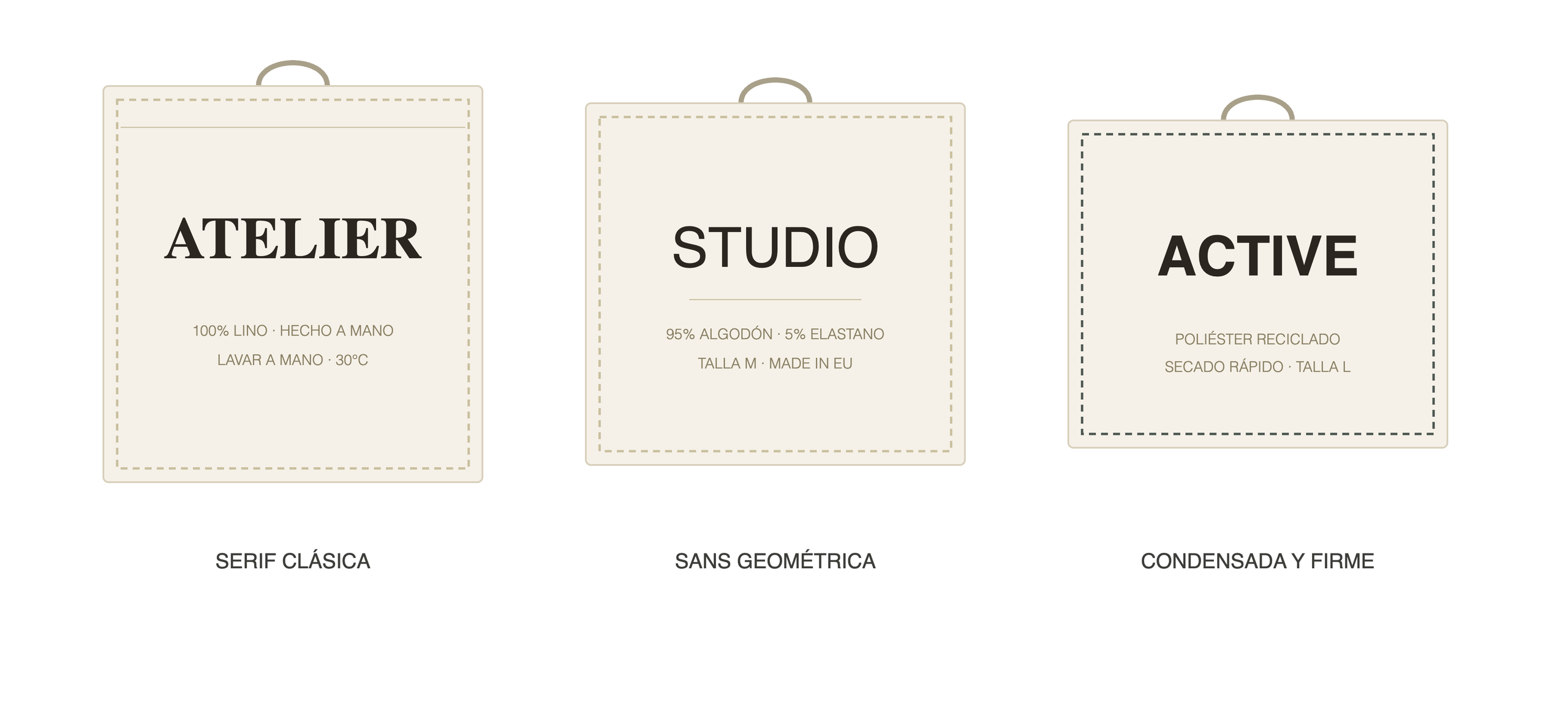
And that’s without even playing with colours or the material and texture of the label… But, as we’ve mentioned, no typeface is objectively better than another: each one answers a different question that the person asks themselves as they reach for the label. Is this well made? Is this for everyday wear? Will this hold up to what I’m going to put it through?
Serif or sans: the first big decision for a label
In fashion, the serif (that small stroke at the end of a letter) is very consistently associated with textile tradition and quality craftsmanship. That’s why many luxury brands and long-established fashion houses still use serif typefaces on their labels: it communicates that there’s a craft behind the garment, not just a factory.
Sans-serif typefaces, on the other hand, communicate contemporaneity, functionality, clothing designed for everyday use rather than special occasions. That’s why they dominate in basics, in streetwear, and in brands that sell practicality. And condensed, bold-stroke typefaces have become almost a code of their own within technical and sportswear textiles: they convey tension, movement, performance.
Weight and spacing: the nuances that also matter
In typography, as in colour, the key often lies in the nuances. The same typeface with a different stroke weight or spacing already changes our perception. For example:
- Bold stroke: strength, seasonality, capsule collections. Works well on statement seasonal pieces.
- Fine stroke: delicacy and care. Common in lingerie, silk or occasion wear.
- Tight letter spacing: energy and urban rhythm. Frequent in streetwear and youth collections.
- Wide letter spacing: breadth and sophistication. Common in prêt-à-porter and premium ranges.
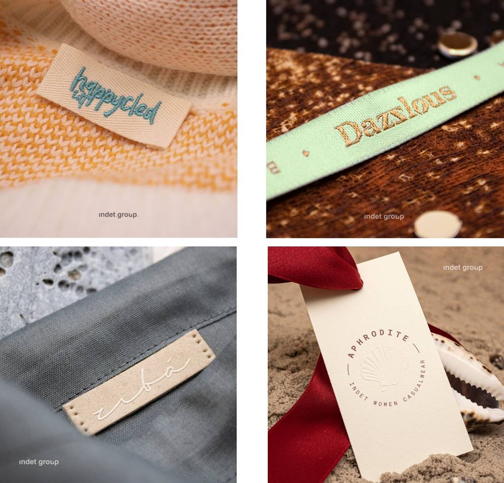
It’s true that nowadays there’s an enormous range of typefaces, and nothing is as simple as “serif or sans-serif”, but what matters in the end is the concept: from the moment we’re choosing one typeface over another, we should be asking ourselves what it conveys and what promise it responds to, not simply whether it suits us aesthetically.
In short, a label’s typography shouldn’t be decided at the end of the process, alongside the size and the washing symbol — it should be built into the design of the customer’s decision-making journey. If you’re thinking about how your brand should “sound” on every label, we’d love to talk.