Each year, as spring arrives, shops and window displays fill up with dusty pinks, soft mints, pale sky blues and delicate lilacs. It’s no coincidence, nor simply seasonal inertia. Behind those chromatic choices lie consumer psychology, branding strategy and a chain of decisions that extends to the finest detail of a garment: its label.
But why does this happen? What lies behind the pattern?
The shades the brain associates with renewal after winter
Color psychology has spent decades studying how different shades influence our mood, perceptions, and purchasing behavior. And pastels have a very specific profile: they are low-saturation colors that the brain processes as soft, light, and calming.
According to these studies, pastel tones evoke feelings of calm, renewal, and optimism—exactly what consumers seek as they emerge from winter. They are, in a way, the visual equivalent of opening a window after months of gray and dark skies.
This has a direct implication for label design: when a brand chooses a pastel color for its spring label, it’s not just following an aesthetic trend. It’s triggering an emotional response. The label, however small, is part of that experience.
The role of Pantone and the catwalks: from the collection to the label
It’s impossible to talk about colour in fashion without mentioning Pantone. Each year, the Pantone Color Institute publishes its trend report for the spring/summer season to coincide with New York Fashion Week, and that report sets the course followed by designers, manufacturers and brands across the world.
In recent seasons, Pantone’s reports had shown a consistent preference for soft, natural tones in spring: fresh greens, dusty pinks, sky blues, lilac. For spring/summer 2025, standout colours included Crocus (a rather charming blend of pink and purple), Moonbeam (a pale, sophisticated grey) and eco-inspired greens — all firmly within the pastel or low-saturation universe.
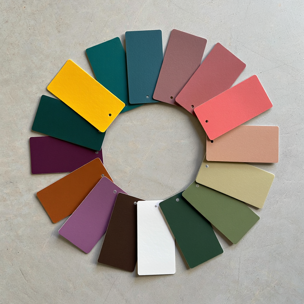
For spring/summer 2026, however, the report introduces an interesting shift. Where the previous year leaned towards calm and nature, this season blends the familiar with the stimulating: warm, recognisable tones sit alongside bolder colours and timeless neutrals.
According to Pantone, this represents a decisive move towards personal expression, partly in response to artificial intelligence and the growing homogenisation of aesthetics. The palette celebrates individualism: from the elegant saturation of aquamarine green Alexandrite to the intensity of Lava Falls red, taking in the ethereal White Onyx and the balanced Sage Green along the way.
What this means for labelling is that the palette is no longer purely soft or purely intense — it is both at once. This demands greater precision from brands in terms of visual coherence: pastels remain present, but now share the stage with stronger tones that call for labels capable of speaking to both registers.
Nature as a source: the colors that spring already brings with it
There is something deeper than trend and marketing behind the dominance of pastels in spring: nature itself. Spring brings with it pale blossom — cherry trees in flower, lilacs, forget-me-nots, daffodils — clearer skies and a quality of light that softens the colours of the world around us. Pastels are, in essence, the colours of natural spring.
This creates what experts call “seasonal coherence”: a customer who walks into a shop in March or April expects to find tones that resonate with what they see outside. When the collection and its labels speak that visual language, a sense of harmony is produced that encourages an emotional connection with the product.
Pastels also have a practical advantage that should not be underestimated: they work well together and with almost anything. This makes them particularly useful for labels that must sit comfortably alongside garments in different colours within the same collection.
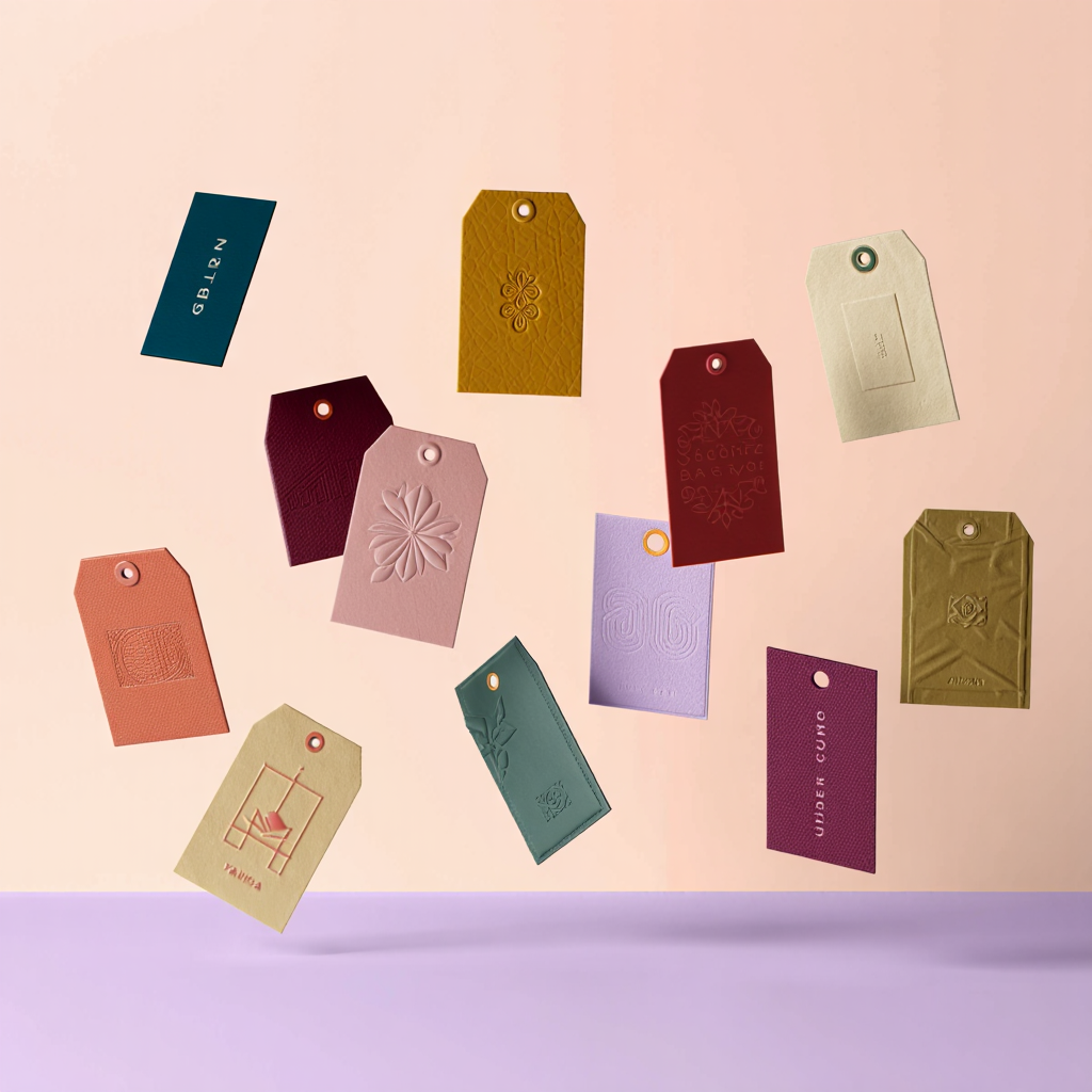
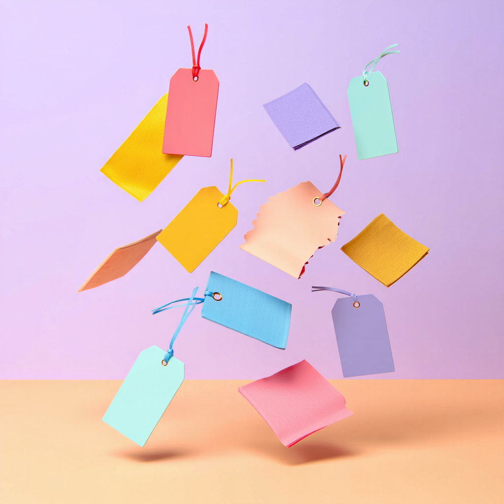
The label as part of the brand’s message
One might assume that a label is a functional element — almost an afterthought. But brands that attend to detail know otherwise. It is one of the last points of contact before the customer takes a garment home, and it forms part of the product’s overall experience.
Chromatic coherence between the label and the collection reinforces visual identity. A brand that commits to pastels in spring and then uses labels in discordant tones is sending a contradictory message — even if the customer cannot always pinpoint exactly why something “doesn’t feel right.”
Pastels done well: between approachability and positioning
That said, it is worth adding a note of nuance: pastel tones do not work equally well for every brand or in every context. Their power lies in how correctly they are applied.
In premium luxury segments, for instance, a fully pastel label can read as more accessible a positioning than intended. Luxury brands that use pastels do so with great precision: high-quality materials, impeccable finishes and carefully calculated combinations that maintain sophistication within the softer register.
The key, as is almost always the case in branding, lies in knowing your target consumer well. Pastels can be romantic, fresh, sophisticated or accessible — depending on how the entire visual communication is constructed. Pastels can be romantic, fresh, sophisticated or accessible — depending on how the entire visual communication is constructed.
Behind a label in pale pink, soft mint or delicate lilac, there is something more than an aesthetic choice. There is psychology, catwalk-validated trends and a deep understanding of what we hope to feel when winter finally departs.
At Indet, our work begins precisely there: in understanding that chromatic language and translating it into labels that speak the same idiom as the garment they accompany. Because details matter.
Further reading:
- X-Rite Blog, Spring Color Update: The Psychology of Pastels
- Pinot’s Palette, The Psychology of Pastels: Why Do Spring Colors Make Us Feel Happier?
- Zigpoll, Harnessing Color Psychology to Curate Clothing Collections
- Disha Fashion Institute, Impact of Color Psychology on Fashion Design
- Pantone / MR Magazine, Pantone Fashion Color Trend Report Spring/Summer 2025 for NYFW
- Pantone / MR Magazine, Pantone Fashion Color Trend Report Spring/Summer 2026 for NYFW
- Saudi Journal of Business and Management Studies, Casas & Chinoperekweyi (2019), Color Psychology and Its Influence on Consumer Buying Behavior: A Case of Apparel Products