There’s a relationship between summer and certain colours or palettes that goes far beyond fashion. It’s an association built up over decades through advertising, cinema and popular culture — and, before all of that, through the senses: the orange of a sunset, the yellow of the sun at its highest point, the red of a freshly cut watermelon, the white of light on a whitewashed wall.
When a label uses these colours, it triggers that memory before the consumer has read a single word. This is no accident — it’s rooted in how colour perception works. Brands know it, and they apply it to their summer collections season after season. But the label, that small yet significant detail, can play its part too. Here are some of the palettes that work best on summer clothing labels.
Orange tones: energy, summer at its most direct
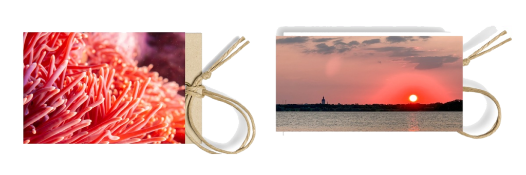
Orange is perhaps the colour most universally associated with summer. It evokes sun, warmth, ripe fruit and sunsets. In its most saturated, luminous form it communicates energy, attitude and vitality. It’s the colour of movement, of sport, of people enjoying themselves outdoors. In softer versions, verging on peach, it conveys warmth without aggression, and works particularly well for brands looking to project approachability and accessibility.
On labels, saturated oranges are especially effective for sportswear, swimwear and resort collections. Softer oranges and peach tones are a better fit for brands with a more understated positioning, lifestyle ranges or childrenswear. The main challenge in print is consistency across materials: this is a palette that calls for validation with a physical sample, as it varies noticeably between papers, fabrics and finishes.
Yellow tones: light, joy, optimism
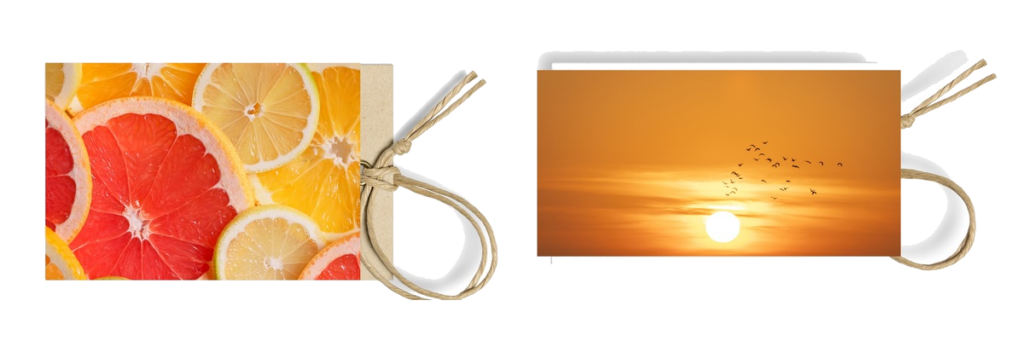
Yellow is the most luminous colour in the visible spectrum, and the human eye picks it up before any other. In summer, it’s the direct light of midday, pale sand, a freshly cut lemon. In terms of communication, it stands for joy, optimism and a carefree spirit. In highly saturated versions it can come across as harsh or difficult to read — this is a palette that works better as an accent than as the outright star.
Golden yellows and warm mustards are the most versatile shades within this range: they bring summery warmth without the visual tension of pure yellow. On fashion labels, yellow finds its best use with brands that have a cheerful, direct identity, in children’s collections and in seasonal accessories. The big challenge is legibility: text on yellow demands particular care with contrast to meet readability requirements.
Reds and corals: intensity, the Mediterranean
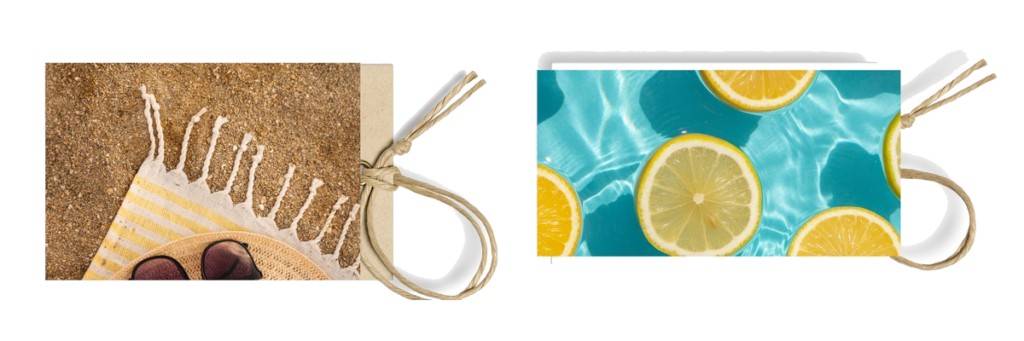
Red is the colour with the greatest emotional impact in the warm spectrum. In summer it softens towards coral, salmon and burnt red, shedding the aggression of pure red and gaining a friendlier, more Mediterranean warmth. Coral is arguably the shade in this range most positively associated with summer: it has the energy of red without its weight, and a luminosity reminiscent of flowers, the sea and the sunsets of southern Europe.
On labels, pure reds work for brands with strong presence and a bold personality. Corals and salmon tones have a broader range of applications: swimwear, holiday wear, women’s summer collections. Burnt reds and brick tones link this palette to terracotta and bring an earthy solidity that makes them particularly interesting for brands with an artisanal or Mediterranean character.
Earth tones and terracotta: roots, authenticity
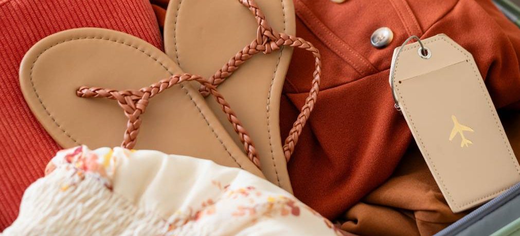
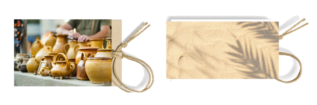
The earth-tone palette is warm without being strident. Terracotta, muted copper, ochre, sienna — these are colours that call to mind ceramics, clay and the parched landscapes of summer. They communicate authenticity, craftsmanship and a certain permanence that sets them apart from the more vibrant warm shades. They don’t shout summer instantly, but they belong to it in a quieter, more enduring way.
This palette is especially valuable on labels for brands with a sustainable or artisanal positioning, and in collections built around a Mediterranean or ethnically inspired aesthetic. It also has a notable practical advantage: its reproducibility in print is more stable than that of the more saturated warm tones, and it performs particularly well on recycled paper and natural fabrics — making it the most coherent choice when the label’s material is itself part of the message.
Whites and warm neutrals: light, cleanness, space
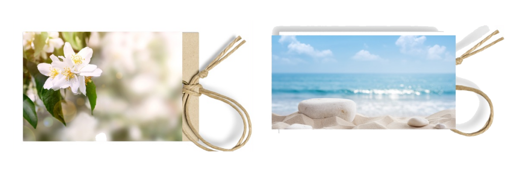
White is the quintessential colour of the Mediterranean summer: whitewashed walls, linen clothing, light that flattens everything. On labels, white and warm neutrals — such as ecru, sand or ivory — are not the absence of colour but an active choice. They communicate cleanness, minimalism and quality without ostentation. They’re the backdrop against which the rest of the summer palette takes centre stage.
For premium brands, warm neutrals are often the foundation on which the entire seasonal visual identity is built. A lightly toasted ecru with typography in dark brown communicates summer in a more sophisticated way than any saturated orange. And in combination with the other warm tones in this guide, they act as the white space that lets the lead colour breathe.
Before choosing: three questions worth asking
The colour of a seasonal label shouldn’t be chosen in isolation. These three questions help you make the decision with better judgement:
Is it consistent with the collection’s palette?
The label is part of the garment — or it should be. If the collection works with a palette of burnt oranges and earth tones, a lemon-yellow label creates a dissonance the consumer will notice even if they can’t quite explain it. Chromatic consistency between garment and label is one of those details that separates a well-resolved project from one left half-finished.
How will it reproduce on the actual material?
What you see on screen and what comes out on satin, recycled paper or organic cotton can differ considerably, especially with saturated warm tones. Defining the colour with a Pantone reference and validating it with a physical proof on the final material isn’t an optional step — it’s the step that decides whether the end result works.
Does it need to change from season to season, or can it be more timeless?
Some colours in the warm range, particularly earth tones and neutrals, have a currency that extends beyond summer. Others, such as the more saturated oranges and yellows, are more closely tied to seasonality. Deciding whether the label colour is a seasonal piece or a more permanent element of the identity affects how production and the brand archive are managed.
One solution that more and more brands are adopting: keep the label’s design and material consistent throughout the year, and use colour as the only element that changes from collection to collection. It’s an efficient way to communicate seasonality without reworking the entire identity — and to build up an archive of labels that, seen together, tell the chromatic story of the brand.
Summer has a palette of its own because it has a light of its own, a temperature of its own, a way of being in the world that’s unlike the rest of the year. Brands that understand this and translate it into their labels aren’t following a trend — they’re being true to the experience they want to create.