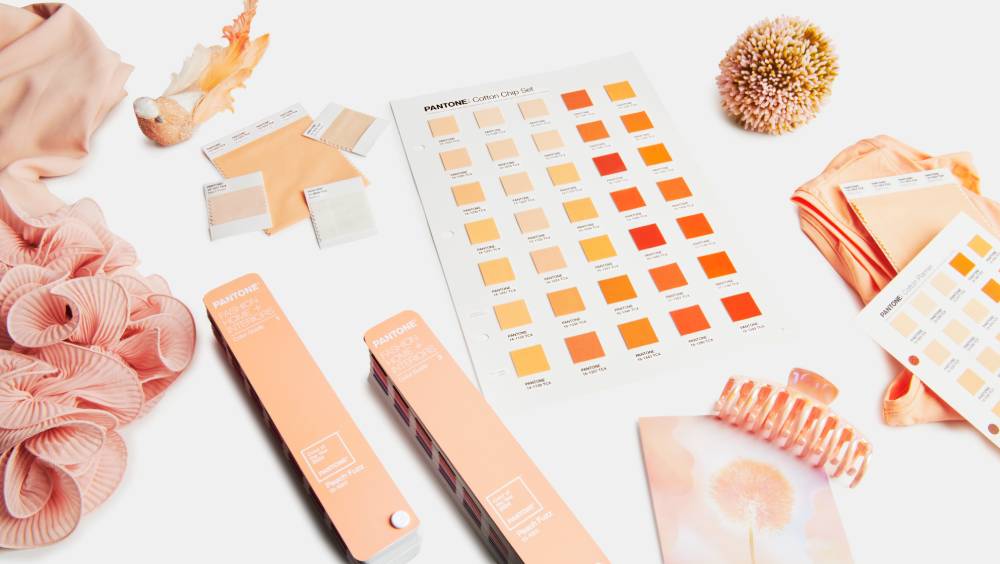
Pantone has won our hearts once again this year. If last year at this time of the year we were filled with energy with its vibrant Viva Magenta, an intense red with pink hues, this year is marked by softness and warmth thanks to its Peach Fuzz.
How would we describe the color Peach Fuzz?
It is a soft, velvety peach tone, the first adjectives that come to mind are enveloping, warm and evocative. It is a substantial departure from the 2023 Viva Magenta Color of the Year.
For 2024, Pantone believes that, “at a time of turmoil in many aspects of our lives, our need for nurturing, empathy and compassion grows ever stronger as does our imaginings of a more peaceful future”. The color Peach Fuzz is precisely that warm and welcoming shade that awakens our desire for togetherness with others and the sense of sanctuary this creates. It is both tender and sensual, sweet and light. For Pantone, it is a shade that evokes the new modernity, in the human experience of enriching and nourishing the mind, body and soul.
For us, the color Peach Fuzz makes us think of moments of intimacy and trust with those who are our refuge, of soft summer evenings, full of flavours and smells that fill our senses without dulling them. We can’t wait for everything to be filled with Peach Fuzz!
Peach Fuzz colour palettes
Pantone Color of the Year is much more than the “fashion colour”, it has become a worldwide cultural icon that reflects how everything that happens globally is expressed through colour. As a result, the Color of the Year influences not only fashion, but also technology, design, art and even food.
And of course, given its increasingly wide range of applications, it is not usually used alone, but is accompanied by five color palettes to reinforce and enrich it.
- Libations: This palette combines Peach Fuzz with soft almond tones and winey colours, such as Marsala, Grapeade and Sauternes, an almost synaesthetic combination of colours that integrate smoothly and can almost be felt on the palate.
- Flavour-full : This palette is more intense than the previous one, but without losing the subdued nuance; even the colours Mango Mint and Party Punch have a certain shade of ripe fruit, without stridency, and the palette as a whole is balanced by the honeyed tones of Dijon Mustard and Honey Yellow.
- Hybrid Hues: A palette of hybrid tones, also full of contrasts without discordance. We find a resounding dark red Sun-Dried Tomato alongside the discreet blue-green Porcelain and Jade Green, and violet tones such as Pale Pansy and Phlox.
- Peach Plethora: The perfect range, the Colour of the Year 2024 is accompanied by soft peach tones such as Pristine, Honey Peach or Peach Puree, as well as cooler shades such as Peach Pink, Peach Blossom or Georgia Peach.
- Pairings: Perhaps the most surprising palette for its vibrant combinations, we find blues and greens in different intensities, such as Nautica Blue, Little Boy Blue or Bermuda, together with intense pinks and a balanced Blazing Orange.
Why is the Color of the Year important?
As mentioned above, the Color of the Year is not just a passing fad, but has become a global cultural reference, serving as an expression of a collective mood and attitude, expressed through the language of color.
Since the launch of the first Color of the Year in 1999, the legendary Cerulean Blue, every year professionals and companies around the world have been inspired by Pantone’s trends for their creations, in sectors as diverse as fashion, cosmetics and beauty, furniture and decoration, and technology and multimedia, among others.


