
Ask anyone in the industry whether a children’s clothing label is the same as an adult one, and the answer will be immediate: of course not. No one is going to say yes — the intuition is correct.
But if you ask them to elaborate on what the differences are, which factors change and why, the answer tends to start well and then trail off. The softness of the material gets a mention, perhaps the regulations, and then there is a pause. The rest — the factors that also matter and that are often left out of the conversation — are not always so present.
Why does this happen? Simply because in the day-to-day of design and production, attention goes where things are urgent. And the label, in many projects, is not urgent until it causes problems.
That is why, in this article, we have brought together those factors in an orderly way: the obvious ones, and those that tend to slip through the net more easily.
Safety and regulations: the obligatory starting point
In adult clothing, regulatory compliance is important. In children’s clothing, it is non-negotiable. The regulation is stricter, more detailed, and under constant revision in almost every market.
In Europe, Regulation (EU) 2023/988 and the specific guidelines for children’s clothing set out requirements covering chemical substances in labelling materials, the strength of fastening elements (seams, clips, rivets), and the absence of parts that could come loose and become a choking hazard. Standard EN 14682, which governs drawstrings and cords in children’s garments, also affects the design of certain labels and garment accessories.
In practical terms, this means that label materials — both the substrate and the inks — must pass specific safety tests, and that elements such as metal staples, rivets, and decorative accessories are subject to restrictions when used on garments for children below a certain age.
A common mistake is to treat label design and regulatory compliance as separate processes. In children’s clothing, the ideal is for both to move forward in parallel from the outset — not for the regulations to arrive as a final review that forces the work to be redone.
Materials: when contact with skin comes first
The skin of a baby or young child is significantly more sensitive than that of an adult. Its skin barrier is less developed, it reacts more readily to irritants, and it can suffer contact reactions or allergies that would go unnoticed in adults.
This has direct implications for the selection of label materials:
| Children's clothing | Adult clothing | |
|---|---|---|
| Inks and dyes Restrictions on potentially irritating or allergenic substances | OEKO-TEX Standard 100 Class I certification (the most stringent, for products in contact with babies) | OEKO-TEX Class II or III are generally sufficient depending on end use |
| Finishes and texture Everything that touches the skin counts | No hard thermosetting finishes or laminates that add stiffness; no sharp edges | Laminates, embossed effects, metallic or thermosetting finishes are common options |
| Label substrate Soft materials with no abrasive finishes are preferred | Preferably satin, organic cotton, or silk; no rigid edges | Greater variety: woven, paper, card, plastic. Finishes are more freely chosen |
| Adhesives and treatments For seamless or direct-application labels | Formulations designed for sensitive skin; no fragrances or unnecessary additives | Greater tolerance. A wider range of adhesive types and surface treatments is accepted |
It is worth mentioning here the seamless or heat-transfer label, which has gained considerable ground in children's clothing for precisely this reason: it eliminates the friction of fabric against the skin. Although it has limitations in terms of the information it can carry and its durability through washing, for certain garments — such as the smallest sizes — it may be the most appropriate solution.
Position and placement: where discomfort gives no warning
An adult wearing a label that scratches at the neck will simply cut it out. A baby cannot do that. And a two-year-old does not yet have the vocabulary to explain that something is bothering them; they only have crying, irritability, and, in some cases, a skin reaction that appears hours later.
For this reason, label placement in children's garments deserves more attention than it usually receives. What should we bear in mind?
- Labels on the inside of the neckline are the most problematic in babywear and early childhood clothing. When we opt for this placement, the material and construction of the label must be handled with particular care: edges folded inwards, ultra-fine fabric, flat seams.
- The lower back and the side (at hip level) are alternatives that avoid contact with the neck area and are frequently used in sleepwear and children's underwear.
- In outer garments with more layers — jackets, coats, dungarees — there is more room for manoeuvre, since the label is not in direct contact with the skin. Here, criteria similar to those used for adult clothing can apply.
Mandatory information: more content, less space
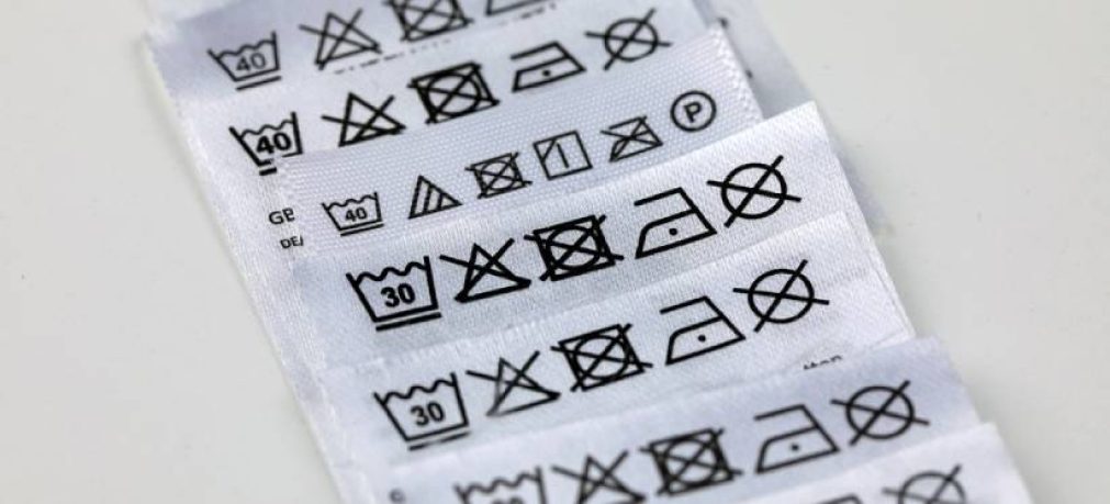
Children's garments carry labelling requirements that in some cases go beyond those for adults. The content that must appear on the label includes, as a minimum: fibre composition, care instructions (ISO care symbols), country of manufacture, size, and the name or trading name and address of the party responsible for placing the product on the market.
So far, similar to adult clothing. But in children's clothing there are additional considerations:
- Sizing in children's clothing follows systems that vary significantly from market to market. In Europe, the height-based system (in centimetres), the age-based system, and national standards with their own scales all coexist. This requires labels to carry a greater amount of information, or more complex multi-market labelling solutions.
- Garments with functional elements (zip fasteners, press-stud buttons, tapes) often include additional safety information directed at the responsible adult, particularly in the smallest sizes.
- And if the garment carries any kind of performance claim or certification — swimwear with UV protection, or outerwear with a recommended temperature range — this information must appear in a legible and comprehensible form.
All of this information has to fit within a space that, in babywear, can be very limited. The typographic design and visual hierarchy of the label become especially critical: legibility must be guaranteed with font sizes that are not always generous.
Visual design: balancing brand identity and context of use
The visual design of a children's clothing label must balance three interests that do not always point in the same direction: the brand's identity, communication with the adult buyer (who is the one making the purchase decision), and suitability for the end user — the child wearing the garment.
Typography
In adult clothing, label typography is above all a vehicle for brand identity: elegant serif for luxury, geometric sans-serif for contemporary, condensed and technical for sportswear. In children's clothing, legibility carries more weight. Not because children are going to read the label, but because the adult buyer — often in poor lighting or in a hurry — needs to find the relevant information quickly.
Colour and finishes
Metallic finishes, gold or silver hot stamping, and high-gloss laminates are common on premium adult labels. In children's clothing, these finishes can create safety issues (hard edges after washing, flaking inks) and conflict with the requirement for materials certified for sensitive skin. They are not prohibited in all applications, but their use requires more thorough validation.
Format and construction
Adult labels lend themselves to more elaborate formats: multiple layers, concertina-style solutions for lengthy text, swing tags with special finishes. In children's clothing, the tendency is towards constructional simplicity — precisely because fewer seams, fewer layers, and fewer fastening elements mean fewer points of friction and less risk.
The buyer is not the user: a particular feature of children's labelling
This is perhaps the most fundamental difference, and the one that most affects design strategy. In adult clothing, the person who buys and the person who wears are one and the same. In children's clothing, they almost never are.
The buyer is an adult making decisions based on their own criteria: price, aesthetics, brand, practicality. The user is a child who had no part in that decision and who is going to experience the garment in an entirely different way.
This has direct consequences for how the label is designed. The information must be useful and legible for the adult who buys. The construction and materials must be safe and comfortable for the child who wears it. And the visual identity must communicate values that speak to the adult at the moment of purchase.
In short, a children's clothing label is not a scaled-down version of an adult one. It is an object with its own demands, its own constraints, and its own logic. Treating it as an adaptation is, at best, an oversimplification that may prove costly further down the line.