Have you ever found yourself struggling to read the information on a clothing label? You’re not alone. It happens to many people. Whether someone is trying to check the fabric composition, understand the washing instructions, or confirm the size, poor legibility can negatively impact both the customer experience and the brand’s image.
Even though labels are usually small and offer limited space to convey information, their importance is huge—both from a legal and a visual standpoint.
That’s why we often get asked: what’s the ideal font and size to use on a clothing label? Let’s break it down:
1. Legibility comes first
It might sound obvious, but if the text on a label isn’t easy to read, the label isn’t doing its job. Clear information not only helps the user—it also builds trust and makes the garment easier to care for and use.
Recommended minimum size
While not all countries require a specific font size, the standard industry practice is to use a minimum of 6 points for informational text such as care instructions or fabric composition. That said, legibility can vary depending on the font. Some typefaces at 6pt are still hard to read, so we recommend using 7 or even 8 points whenever possible—especially if your garments are sold in multiple markets.
Functional typefaces
Sans-serif fonts like Arial, Helvetica, or Univers are best suited for small-sized text. They’re clean and easy to read, even on textured fabrics or delicate materials. Avoid decorative or ultra-thin fonts for informational text—they’re harder to read. Save those styles for your brand name or logo, and always use a larger size in those cases.
2. Design with international regulations in mind
If you produce garments for multiple markets, your labels will likely need to include content in several languages. This can make space tight, so smart layout and font choices are essential.
Use font size strategically
Prioritize key information—such as fabric composition or care symbols—by giving it more prominence through size. Secondary details or translations can be slightly smaller, but they should always remain readable.
Pay attention to non-latin scripts
Languages like Chinese, Japanese, Arabic, or Cyrillic often require a slightly larger font size or increased weight to maintain good legibility.
Every country has its own rules
Some regions specify minimum font sizes for certain types of information; others require the content to be in the official language or follow a specific format. Always check the regulations for the destination country before finalizing your label design.
3. Balancing branding and functionality
A clothing label isn’t just a legal requirement—it’s also an extension of your brand. But striking the right balance between style and clarity is key.
Your brand name or logo can reflect your identity. It’s perfectly fine to use a more distinctive or stylized font for branding elements. However, technical information should always be presented in a clean, easy-to-read typeface.
Try to avoid overcrowding. Don’t cram all the content into a single small area. Folded or multi-layered labels are a smart solution—they allow you to include more information without sacrificing clarity or organization.
Use visual hierarchy to your advantage. Bold text, icons, and line breaks can help guide the reader’s eye and structure the content in a way that feels intuitive and accessible.
4. Consider the label material and fabric
The type of label material and the fabric it’s sewn onto can significantly impact how the typography looks—and how well it holds up over time.
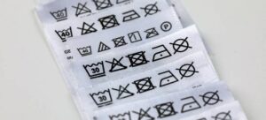
- Woven labels: Due to the thread-based construction, fonts need to be thicker and larger—at least 8 points is recommended. Thin lettering can blur or become unreadable during production.
- Printed labels (satin, cotton, TPU, etc.): These materials allow for finer lines and smaller font sizes. However, it’s essential to test how well the print holds up through washing and regular wear.
- Contrast matters: Dark text on a light background offers the best legibility. If you’re using colored labels, make sure the ink color contrasts strongly with the background for maximum readability.
5. Test before full production
Even with a solid design and quality materials, real-world testing is essential.
Create physical prototypes
Print and inspect samples before moving to mass production. What looks perfect on screen can behave very differently on fabric.
Test for washing and wear
Make sure the text remains legible after multiple washes. Some inks wear off quickly, and certain printing methods may not withstand friction or heat well.
Gather feedback
Ask for input from your team and test users. Their insights on readability and comfort can be invaluable in fine-tuning the final label design.
In summary, choosing the right font and size for your clothing labels isn’t just about aesthetics—it’s a strategic decision. You’re balancing customer experience, regulations, durability, and branding—all within a space often no bigger than a business card… or even smaller!