Were you surprised by the choice for the Pantone Color of the Year 2026? Looking back, we have gone from an intense and vibrant Viva Magenta to a sweet Peach Fuzz, and from there to an even softer and more discreet Mocha Mousse. And now,
That is precisely what Pantone has identified: in a world saturated with constant demands and digital stimulation, the search for calm has become one of our most essential needs. Therefore, their PANTONE 11-4201 Cloud Dancer is an ethereal white that simultaneously symbolizes serenity and the promise of a new beginning.
What message does it aim to convey? With this choice, the Pantone team wants to reflect what is happening in global culture and what people are seeking. For 2026, the selection of Cloud Dancer underscores a collective desire for “truth, possibility, and a new way of living.” We seek relief from the overstimulation of 24/7 culture to rejuvenate mentally, physically, and emotionally.
Cloud Dancer is much more than a simple white; it is a “conscious statement of simplification.”
According to Leatrice Eiseman, Executive Director of the Pantone Color Institute, “At this time of transformation, when we are reimagining our future and our place in the world, PANTONE 11-4201 Cloud Dancer is a discrete white hue offering a promise of clarity. The cacophony that surrounds us has become overwhelming, making it harder to hear the voices of our inner selves. A conscious statement of simplification, Cloud Dancer enhances our focus, providing release from the distraction of external influences.”
Cloud Dancer, a Blank Canvas for Fashion and Label Design
For us, PANTONE 11-4201 Cloud Dancer is a fundamentally structural shade. Being a “blank canvas,” it symbolizes the desire for a new approach and the liberation from outdated thinking, while simultaneously fostering creativity, which we have to admit, we absolutely love…
Furthermore, thanks to Cloud Dancer’s great ability to combine, the color palettes proposed by Pantone are incredibly versatile:
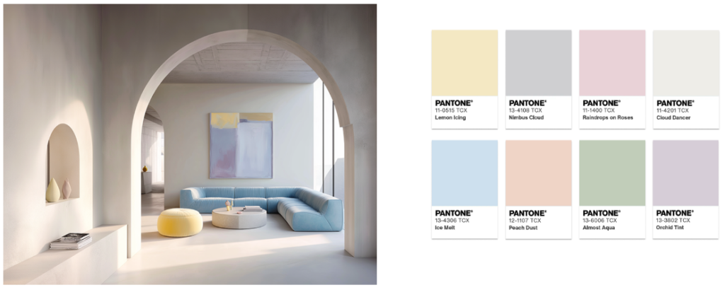
Powdered pastels
Pastel and neutral tones pair perfectly with Cloud Dancer, offering subtle, nuanced changes in shade that are pleasant and discreet. This palette radiates softness and lightness.
It is ideal for children’s fashion lines, loungewear, and minimalist collections. In woven or care labels, using Cloud Dancer as the background white with text in a dove gray or pale pink creates a feeling of extreme delicacy and purity.
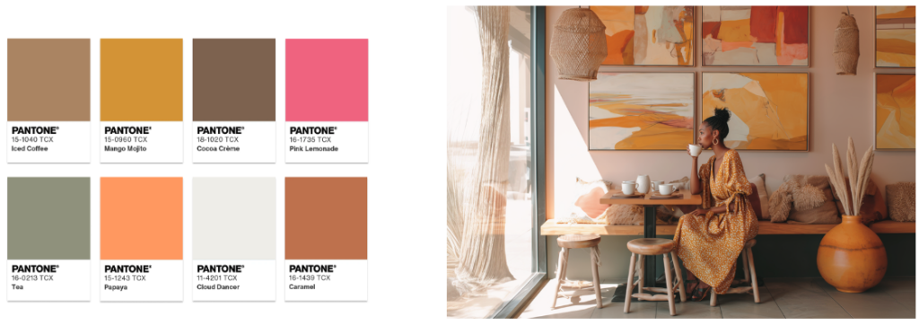
Take a break
Naturally, Cloud Dancer invites us to “Take a Break,” tempting us to sample a variety of exciting nuances: pink lemonade or sparkling papaya, a delicious caramel or cocoa cream, or a sip of tea or a mango mojito.
This palette is perfect for youth fashion lines or seasonal lines that seek joy and optimism. Cloud Dancer can be used on textured paper hang tags, with the logo or a detail printed in a strong accent color (such as “pink lemonade”) to evoke effervescence.
Atmospheric
In this palette, the diaphanous white evokes gray skies, revealing clear and fresh blues beneath a hazy sunlight. The watery greenish blues emanate from the aquatic depths.
We see this applied to technical brands, activewear, or nature-inspired collections. Using Cloud Dancer as the base color on rubber or transfer labels applied to garments in “gray sky” or “fresh blue” colors creates a clean and functional contrast, evoking atmospheric clarity.

Comfort Zone
We all need a comfort zone. The natural and organic colors surrounding Cloud Dancer in this palette are enveloping and convey a comforting sense of repose.
This fits perfectly on woven organic cotton labels with text threads in warm earth tones or moss green. This reinforces the message of “connection and repose” and underscores the authenticity of the fiber, aligning with the consumer’s search for what is “natural” and “real.”

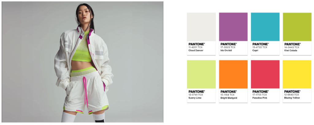
Tropic Tonalities
At certain times, we might also need a little spark to disconnect, which Pantone achieves with this palette of vivid colors like a turquoise ocean, refreshing citrus, bright flowers, and exotic birds. If there’s a cloud in this sunny paradise, it’s a swirling and cheerful Cloud Dancer.
We envision this in resort collections and swimwear. Here, Cloud Dancer acts as the neutralizing color. On composition labels, it allows the garment colors to shine, while on hang tags, the white is used as the background with a vibrant graphic design incorporating the turquoise and citrus tones.
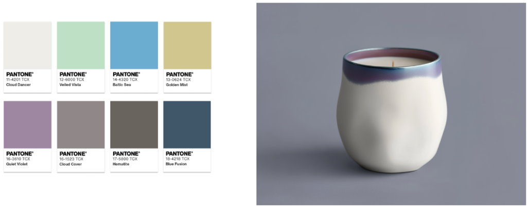
Shadows and Lights
In this palette, Cloud Dancer blends into a veiled array of soft tones that ultimately dissolve into shadows, creating a simple and natural color contrast. It comprises mid-tones of greens, blues, and mauves, combined with brownish and bluish grays, and the Cloud Dancer palette evokes natural landscapes that merge earth, water, and sky under a soft light.
On labels, the use of Cloud Dancer text threads on a bluish-gray or taupe background on woven labels reinforces the message of subtlety and timeless elegance.
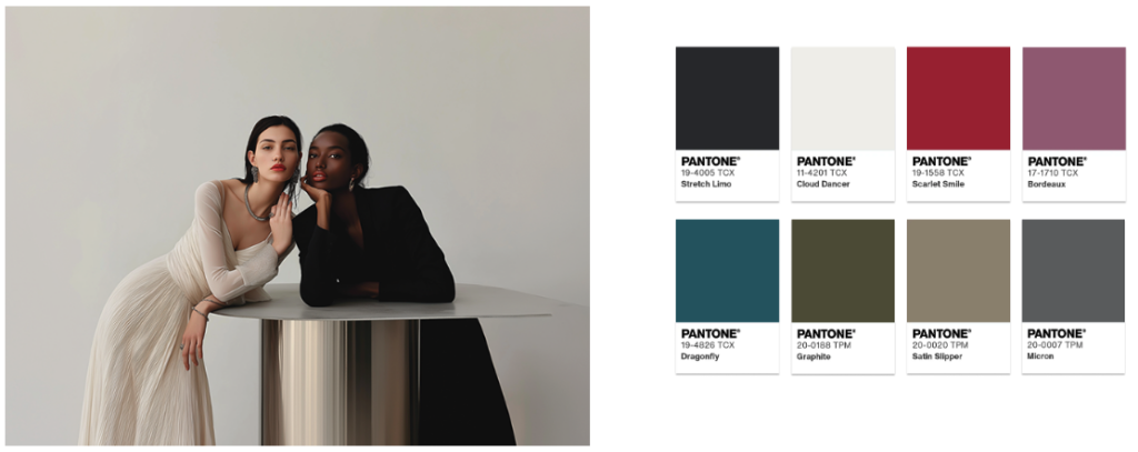
Glamour and Gleam
In this palette, the yin of white inevitably meets the yang of black, accentuated by a seductive red lip. Glamour is intensified with vibrant yellows, greens, and lilacs. Cloud Dancer acts as the highlight, enhancing the radiance.
For labels, matte black paper with the logo printed in a satin silver metallic tone can be used for high impact. To add a touch of color, red lipstick can be used as a fastening thread or in a small graphic detail.
The 2026 Color Can Be Whatever You Want It To Be
PANTONE 11-4201 Cloud Dancer sends an essential message: true strength lies in simplicity, and a relaxing pause is always necessary on the path to innovation.
We conclude with the words of Laurie Pressman: “PANTONE 11-4201 Cloud Dancer is an airy white hue that exemplifies our search for balance between our digital future and our primal need for human connection—a liminal space that is a launchpad for creative expression.”