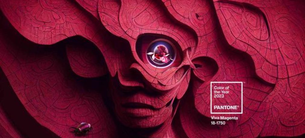
The Pantone Guide has already revealed their Colour of the Year for 2023, and we love it! Viva Magenta, Pantone reference 18-1750, is a deep red colour with pink hues, an expression of strength and vitality.
As every year, professionals in fashion, graphic design, and other sectors await the announcement of the colours that will the inspire design trends of the year, and Pantone has been a benchmark for decades in this regard. This year, it had seemed that the chosen colour would be more of a lavender tone, but the brand has decided to inject a strong dose of energy into 2023 with a much more vibrant colour.
How would we describe Viva Magenta?
According to Pantone, it is an animated red that transmits pure energy, and that encourages unrestricted experimentation and self-expression. It is a vital, bold, rebellious, and limitless colour. At the same time, it is also an inclusive colour, that invites everyone to enjoy it.
Its reddish tone reminds us of the natural colour of the cochineal and the dye, Carmine, that is extracted from this small insect. This is not a chance connection, as Pantone wanted to find a colour that connects with nature and more sustainable lifestyles. Above all, the brand wanted to “create a disconnection with technology” which is so omnipresent in our daily lives, and opt for a colour that, aside from the obvious palette of forest greens and ocean blues, offered us that reconnection with nature.
The importance of colour psychology
Why is it important to create new colour trends, and what does Viva Magenta give us specifically? Colour psychology analyses the effect of colour on the mood and behaviour of people. Although Goethe and Eva Heller the foundations for the modern study of this field, Aristotle, Leonardo da Vinci, and Isaac Newton had already realised the importance of this, and applied colours with a certain intention, beyond a purely aesthetic approach.
The colours around us can therefore influence our emotions and our mood, for example, making us more irritable or impatient, or relaxing us and helping us to concentrate.
In the case of Viva Magenta, this colour balances boldness with a sense of fun. It radiates a soft rebellion that pushes us to show our own true colours, it transmits confidence, empathy, and connections between people. According to Pantone, Viva Magenta “responds to a collective need for strength“. And after the last few years of emotional, economic, and social instability, it is precisely what we need.

How to use Viva Magenta?
We can either embrace it as the main colour and take full advantage of it or use it as a complement to evoke a more discreet effect. One thing is certain, however, whether in fashion design, home and interior decor, graphic design, or packaging, it is an element not to be missed in our new creations.
Viva Magenta will change the trends that we have seen in recent times in graphic design: The phase of pale and neutral tones is over, this colour will have a radical effect on new designs and will renew digital environments.
And what can we say about the packaging? This magenta tone is ideal to capture attention, seduce and provoke intense reactions in consumers: power, strength, energy, passion, and love.
But no colour is an island: the #Magentaverse defined by Pantone includes seven colours in soft pastel tones that balance the vivacity and brightness of Viva Magenta. So, get to work, and create beautiful combinations with this new trend!


