October arrives and something shifts in the way we look at things. The days grow shorter, we take our woollen jumpers out of the wardrobe, the afternoon light turns more golden and, almost without realising it, we start seeking out whatever keeps us warm: a hot drink, a blanket, a garment that feels good to the touch.
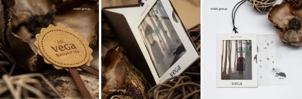
In this context, earth tones and neutrals such as camel, tobacco, sand, chocolate, ecru and stone are not just “the colours of autumn” out of habit. They work because they connect with two very specific desires at this time of year: feeling close to nature and feeling comfortable. But what exactly makes us feel this way, and how does it apply to clothing label design?
A connection with deep roots: biophilia
There is a concept that goes a long way towards explaining why a warm brown or an off-white beige feels so welcoming to us: biophilia, the human tendency to seek contact with nature. From this idea came biophilic design, which aims to bring natural elements into the spaces where we live and work.
One of its leading figures, the researcher Stephen Kellert, included natural colours among the attributes of this type of design. He was referring to the tones we commonly find in the natural environment: browns, greens and muted blues, the so-called earth tones. An earth tone therefore triggers associations with nature that customers perceive and value, and that is exactly what we are interested in for a label.
What customers read (without realising) in an earth tone
Colour is one of the first things we process about a product, long before we read a single word. According to Exciting red and competent blue: the importance of color in marketing, colour influences the personality we attribute to a brand and our purchase intention. Since then, research has been refining what soft, natural palettes convey in particular.
Naturalness and sustainability. A study on “intuitively sustainable” packaging found that consumers associate greens, browns, natural colours and a harmonious tonality with sustainability, whereas glossy finishes detract from that perception.
Less saturation, more trust. This is perhaps the most interesting finding. Several experiments showed that we unconsciously associate low-saturation colours with a “gentler” environmental impact. This perception works through three routes: materials that seem more natural, and a product that feels more authentic and more durable. The result? Greater trust in the brand, higher purchase intention and a greater willingness to pay a premium.
Softness versus power. The flip side is highly saturated colours, which make a product seem more powerful. That is why, when the aim is to convey delicacy, high saturation can work against you and it is best to tone it down. Translated to fashion: a soft knitted jumper, a baby garment or an organic cotton basic all call for muted tones.
Put it all together and an earth or neutral tone whispers three ideas to the customer: this is natural, this is honest and this will treat me well. Precisely the comfort we crave in autumn.
From chocolate to cloud white: neutrals are no longer an “absence of colour”
For years, neutrals were the safe option, the one chosen when you did not want to take risks. That has changed, and the leading authorities on colour are making it clear.
Pantone chose Mocha Mousse as its 2025 Colour of the Year, a warm brown it explicitly linked to the desire for comfort and a deeper connection with the natural world. Brown was no longer merely “rustic”; it had entered the realm of understated luxury.
In 2026, Pantone went even further and chose Cloud Dancer, the first white ever to receive this distinction, as its Colour of the Year. It presented it as a shade of calm and simplification in the face of overstimulation. Very few neutrals have been chosen since the programme began: Sand Dollar, Ultimate Gray, Mocha Mousse and Cloud Dancer. The fact that two of them have come back to back says a great deal about the moment we are living in.
How to bring it to the label (and make it work)
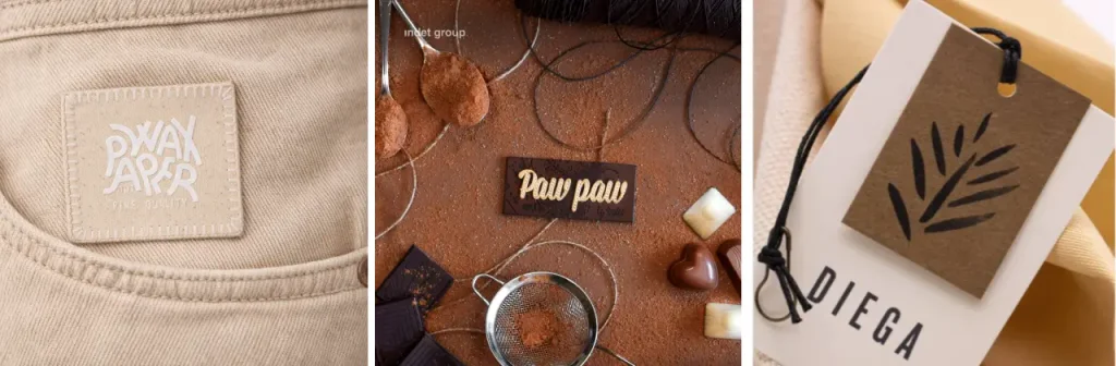
A label in earth tones is not designed in the same way as a wall or a sofa. It is small, attached to the garment and has to communicate in just a few centimetres. Here are some key points we often share with the brands we work with:
- Material and colour, always together. The natural effect is multiplied when the base material plays its part: cotton, kraft card, uncoated recycled paper or textured fabrics. A beige on glossy satin loses some of its charm; on matt cotton, it gains it.
- Matt before gloss. If the aim is to convey naturalness or a commitment to sustainability, glossy finishes work against you. Save the shine for a single detail, such as an embossed logo.
- Lower the saturation. A muted terracotta, a sage green or a soft camel reinforce the idea of authenticity and durability. But do not make it a universal rule: if your product is technical or high-performance, a very subdued neutral may take away some of its strength.
- Mind the contrast. Composition, care instructions, size: everything has to be easy to read. Light brown text on a sand background may look beautiful on screen and be almost illegible in the hand.
- Play with the family, not a single tone. Ecru, stone, tobacco and chocolate sit together beautifully and let you distinguish between lines or collections without leaving the same palette.
- Consistency from start to finish. The woven label, the swing tag, the bag and the shipping box are all part of the same experience. If the label speaks of nature and the rest of the packaging does not, the message gets diluted.
- Make sure natural is not just an aesthetic. Earth tones create expectations of sustainability. Back them up with genuine materials and certifications so that the perception holds and does not backfire.
More than a seasonal trend
Ultimately, earth tones and neutrals connect with something deeply human, such as the need for calm, for closeness to nature, for things that feel authentic, and autumn simply makes it more obvious.
For a brand, the question is not whether to use these palettes, but how to use them so they say exactly what it wants to say. If you are thinking of giving your labels a more natural twist this season, or would like to explore which combination of colour and material best suits your identity, we would be delighted to help you find it.