In the fashion world, staying ahead means anticipating trends. At Indet, we design our new label collections with future color trends in mind, ensuring they’re perfectly aligned with our clients’ collections from day one.
We’re already working on the trends for Spring–Summer 2027! The upcoming shades are diverse and full of personality — from bold, vibrant hues to soft pastels, earthy tones, and palettes with an industrial, modern edge. Each color group has its own distinct character, perfect for labels that capture the essence of your brand.
1. Vibrant Energy: Bold and Expressive
Colors: Blue Courage, Pink Euphoria, Orange Pulse, Turquoise Splash, Radiant Yellow, Fuchsia Shot
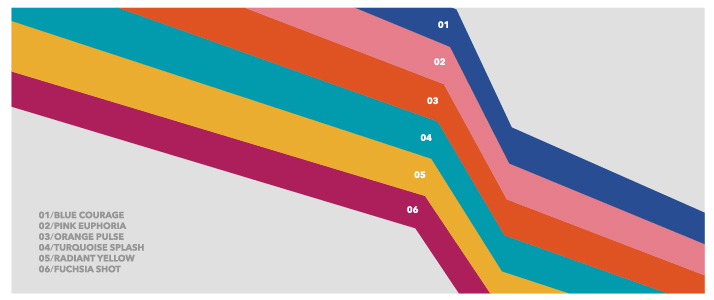
This palette radiates joy, confidence, and optimism. Think summer festivals, streets adorned with murals, or the thrill of a colorful outfit — that’s the feeling these shades evoke.
- Blue Courage adds depth and stability, grounding the more intense colors.
- Pink Euphoria and Fuchsia Shot are playful, daring, and full of life.
- Orange Pulse and Radiant Yellow exude warmth and instant energy.
- Turquoise Splash refreshes the palette and brings balance.
How to use it: Pair deep blues with vibrant oranges or pinks for labels that truly pop. Turquoise Splash works beautifully in small accents, while Fuchsia Shot can make logos stand out without overwhelming the design.
Why it works: This is a confident, cheerful, no-holds-barred palette, perfect for summer collections and brands that want to convey energy at first glance.
2. Soft Serenity: Delicate and Light
Colors: Wadded Grey, Iced Pink, Powder Green, Violet Chalk, Yellow Foam, Latex Blue, Mint Cream
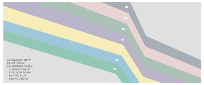
Gentle, delicate, and calm, this palette evokes spring mornings, lightweight fabrics, and a subtle, elegant style.
- Wadded Grey and Latex Blue provide stability and balance.
- Iced Pink, Powder Green, and Mint Cream convey freshness, delicacy, and a touch of romance.
- Violet Chalk adds effortless sophistication.
- Yellow Foam brings warmth and optimism without being overpowering.
How to use it: Combine pastels with each other for a harmonious effect, or pair them with grey for contrast. Perfect for labels on lightweight fabrics like cotton, linen, or silk, giving an elegant yet approachable touch.
Why it works: Labels using these shades communicate calmness, delicacy, and refinement — ideal for collections aiming for a subtle and appealing style.
3. Natural Harmony: Earthy and Organic
Colors: Biotic Green, Antidote Lime, Golden Clay, Orange Milk, Raw Earth, Fertile Khaki
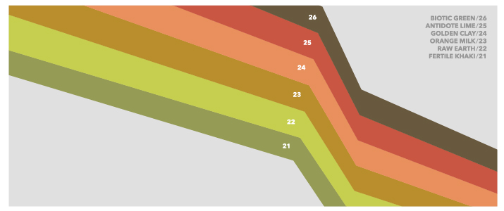
Inspired by nature, landscapes, and organic textures, this palette conveys warmth, balance, and authenticity.
- Biotic Green and Antidote Lime bring vitality and freshness.
- Golden Clay and Raw Earth add depth and warmth.
- Orange Milk provides a soft, luminous touch.
- Fertile Khaki serves as a neutral base that ties the palette together.
How to use it: Mix earthy neutrals with livelier greens for a balanced look. Perfect for labels on artisanal fabrics or sustainable collections, these colors make labels feel authentic and approachable.
Why it works: They communicate care, sustainability, and a connection to nature — ideal for brands that want to reflect ecological or artisanal values.
4. Industrial Air: Bold and Utilitarian
Colors: Block Red, White Glue, Elementary Brown, Lab Green, Machine Blue, Utilitarian Red, Solid Blue
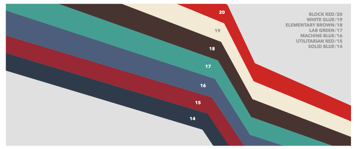
Modern, structured, and practical, this palette draws inspiration from urban environments, contemporary architecture, and workwear aesthetics.
- Block Red and Utilitarian Red are striking and confident, perfect for high-impact details.
- Machine Blue and Solid Blue bring structure and reliability.
- White Glue provides a clean contrast for logos or label backgrounds.
- Elementary Brown and Lab Green add depth and an experimental touch.
How to use it: Pair reds with blues or neutrals for an urban, contemporary look. Small white accents can make logos or details pop without overwhelming the design.
Why it works: This is a modern, functional, and characterful palette — ideal for urban, experimental, or workwear-inspired collections.
Spring–Summer 2027 is defined by contrasts: intense energy, delicate pastels, earthy warmth, and industrial precision. Each palette tells a story, and your labels are the opening chapter.