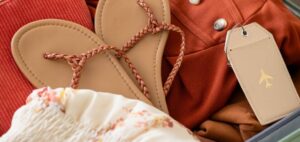
Every brand has its own style, with lines and details that make it unique and immediately recognizable to its followers. However, when launching new collections—especially those aiming to appeal to a different audience or explore trends—it is essential for the brand to maintain its identity while adapting to these specific styles.
Labels are no exception; they must follow the same strategy of balancing the brand’s essence with the particular style of the collection—and the type of customer it targets.
To achieve this, the principles of fashion psychology can be extremely useful, helping to understand the nuances of adapting to luxury, urban, or sports collections, as well as the colors that are trending in a given season.
1. Minimalism and Nordic Style: Less Is More
Minimalist styles tend not to go out of fashion, so it’s likely that at some point we’ll launch a collection following neutral and solid color lines, simple colors—though not everything has to be white, black, or beige!—natural fabrics, timelessness, and versatility. A clothing label for a minimalist line should therefore be both functional and elegant. How can we achieve this?
- We would choose natural materials, such as organic cotton or other fabrics, or textured recycled paper.
- Design and typography: The key is “breathing space” or white space, paired with clean, geometric sans-serif fonts (think Helvetica or Futura) or highly refined, well-spaced serif fonts.
- Color palette: It doesn’t have to be strictly subdued. Minimalist designs often use black on white, white on black, or monochromatic raw/beige tones, but carefully chosen richer tones, like burgundy or dark blue, can also work
The key is to avoid flashy colors and complex designs. Elegance and simplicity should be reflected in every element of the label: materials, colors, typography, and shape.
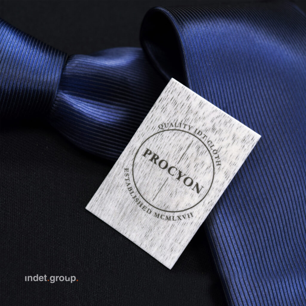
2. Luxury and Haute Couture: Craftsmanship Is the New Trend
When it comes to luxury and haute couture collections, the main challenge is knowing what is associated with luxury at any given time. For example, a decade ago, luxury was linked to excessive sparkle and ostentatious use of gold. Today, however, luxury tends to lean more toward exclusivity, discretion, and elegance, with black being the ultimate expression of this trend—bringing to mind the controversy when the rights to use Vantablack, “the blackest black in the world,” were restricted. Recycled materials, in line with sustainable trends, are also becoming a distinguishing feature of luxury and haute couture collections.
- For these collections, we can choose high-quality fabrics that are recycled or recyclable, or heavyweight recycled paperboard.
- Designs tend to be more elaborate, though without the excesses of the past. Elegant serif fonts (like Didot or Garamond) or script fonts are ideal.
- Deep, rich colors such as midnight blue, burgundy, or bottle green are common. Metallic details in gold, silver, or bronze can be included, but without overloading—the focus should always be on elegance and quality.
- Finishes: Techniques that mimic artisanal craftsmanship, like 3D embroidery, embossed inks, or wax seals, are trending.
Pro tip: If possible, include details that denote exclusivity, such as “handmade in…” or a limited edition serial number.
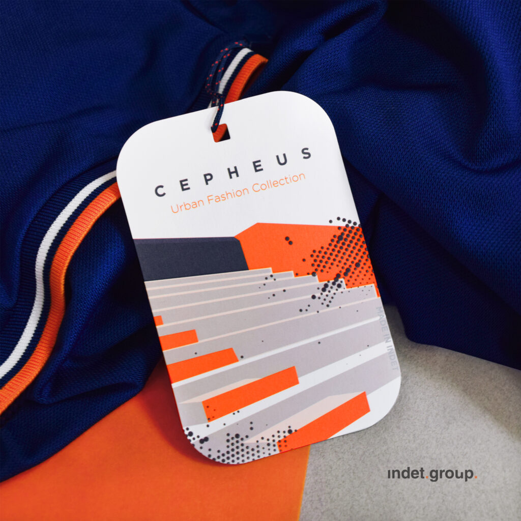
3. Urban Style and Streetwear: Breaking the Rules
If one style has radically changed the way we perceive fashion at a social level, it is the urban or streetwear style. What was once perceived as informal, unkempt, and only suitable for certain familiar situations, is now perfectly acceptable in professional and formal environments. This is a style widely adopted by different consumer profiles, and it is very versatile. In this case, the label can be as versatile as the focus of our collection. What could we opt for?
- In this case, we can play with materials for labels that are more durable and have an industrial touch, such as a textured recycled polyester, Tyvek, or a thick cardstock.
- The typography allows for larger sizes and more striking and informal fonts.
- In this style, color palettes are highly varied, such as high-contrast combinations, neons and fluorescents, intense tones…, although they also admit less intense palettes.
Urban design allows us to experiment, both with materials, colors, and typography, as well as with the very shape of the label.
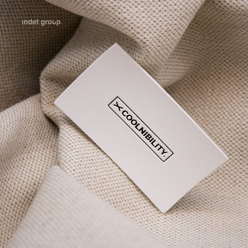
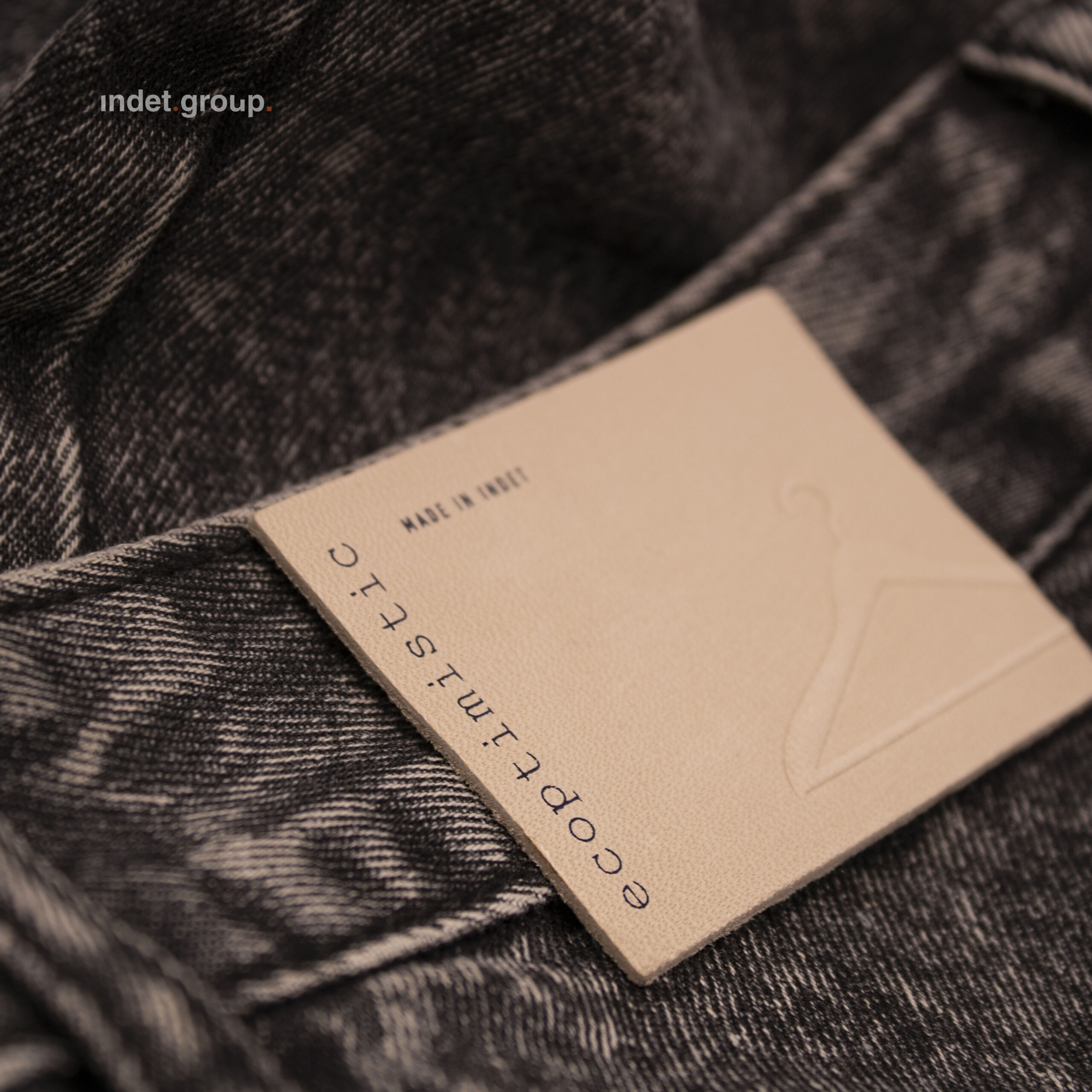
4. Sustainable and Conscious Fashion: Simplicity and Transparency
Some brands base their main value proposition on sustainability, and every garment, down to the smallest detail, communicates this message. However, other brands, even if focused on different styles, may adopt sustainability as an added value or launch specific sustainable collections. When we talk about sustainability, it’s not just about organic cotton; nowadays, it must cover all phases—from the origin and composition of materials to the manufacturing process and ecological footprint. This should be communicated, among other things, through the label.
- Label materials: In a sustainable brand or collection, the material of the label is crucial. Today, there is a wide range of possibilities: recycled Tyvek, stone paper, recycled leather, organic cotton, recycled paper, hemp paper, grass paper, or rice paper.
- Typography and information: Clear fonts are ideal, with special emphasis on sustainability information about the garment (material, origin, etc.).
- Colors: Often associated with nature—earth tones, greens, off-whites, and browns. Combined with natural materials and finishes, they clearly convey the value proposition.
Pro tip: Include a QR code on the label linking to a detailed explanation of the garment’s sustainability: origins, materials, circular economy processes, and more.
In summary: Adapting a brand to a specific collection doesn’t mean completely changing its essence; it’s often a matter of subtle details. It’s about aligning with the particular style we want to convey while preserving our core branding.